In 2025, we were commissioned to update the already beloved logo of Terézváros, one of the most significant tourist districts in Budapest.
We love place branding projects where we can create a cohesive visual identity that is easily recognizable and adaptable to different occasions. Tasks like this challenge us to think and design strategically, striving to achieve a result that the community it represents will love.
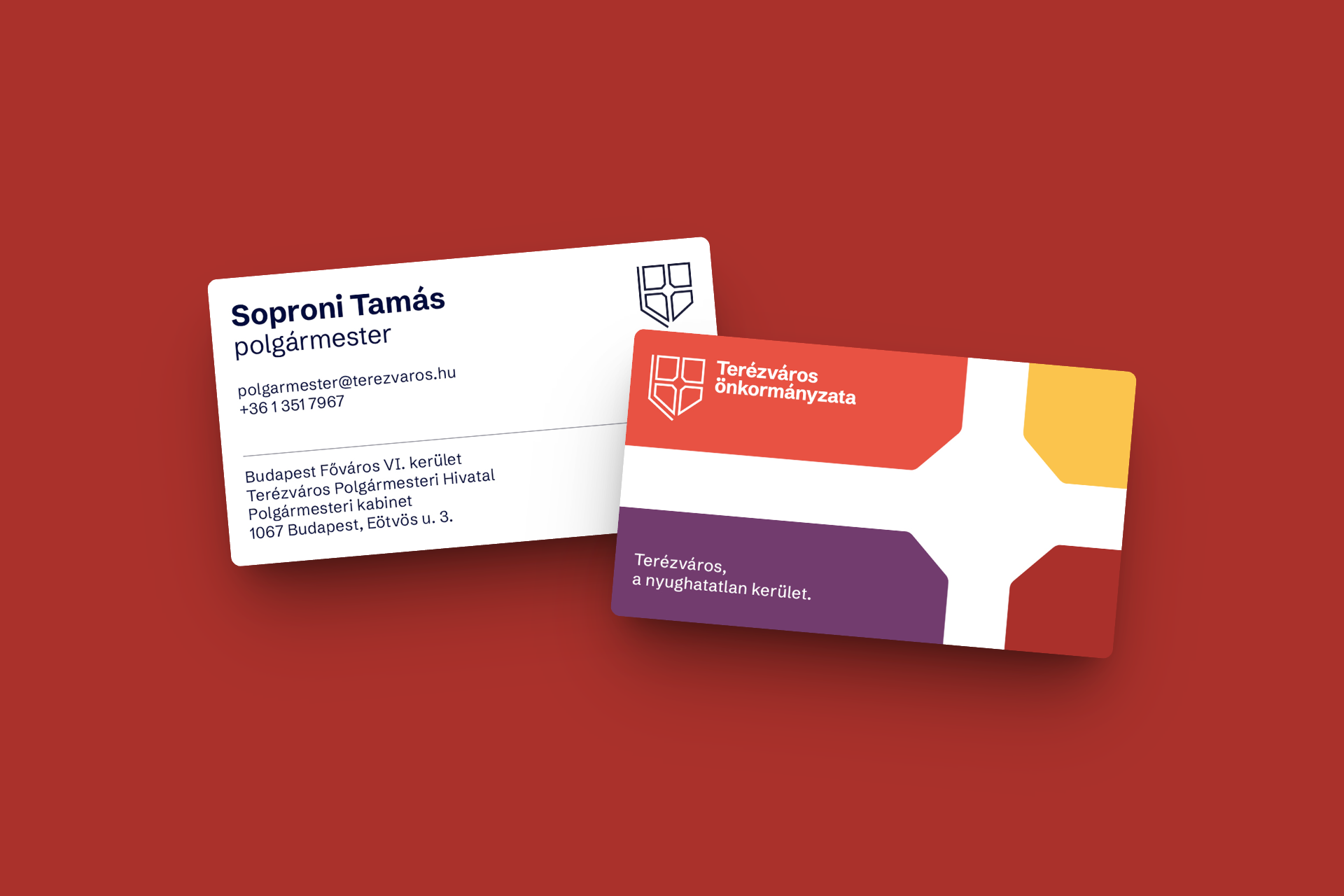
We updated the existing logo and expanded the collection of visual identity elements.
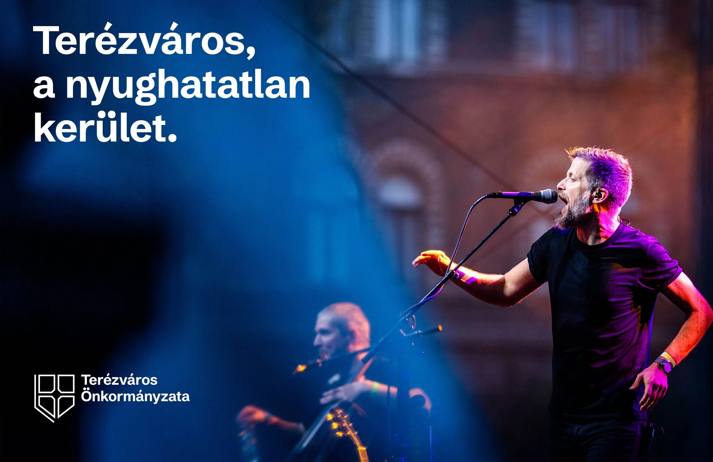
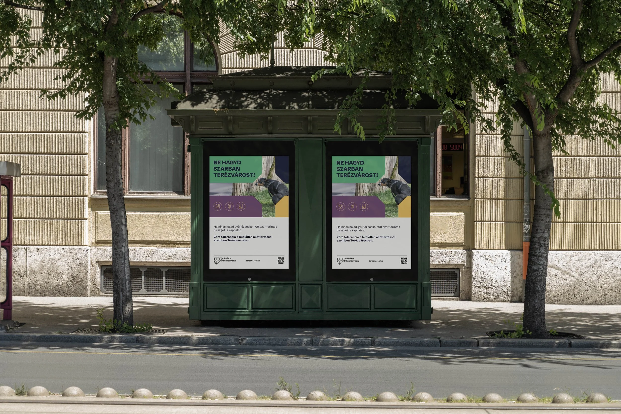
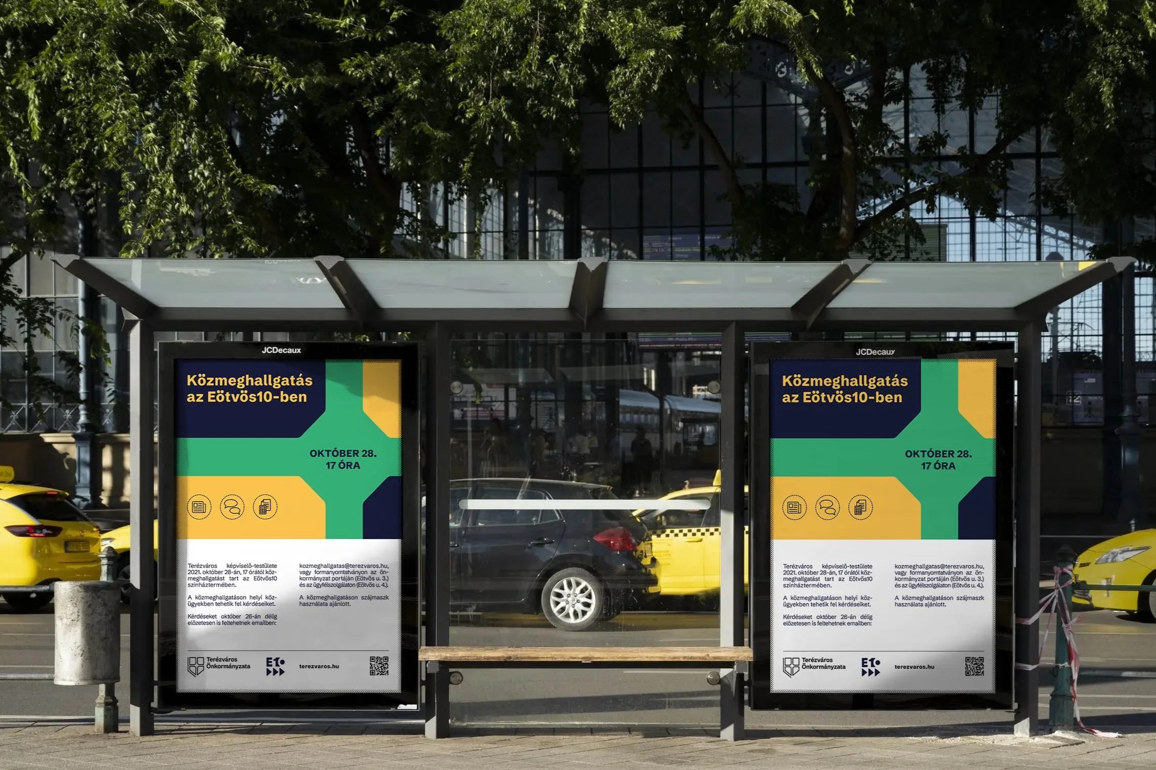
The logo is rooted in the symbolic center of the district: Oktogon. The octagonal form had always been a defining feature, so we chose to emphasize it further and refine its proportions. It was transformed into a cleaner, linear version to ensure better scalability and easy usability.
Brand and Logo update for Terézváros
Designer: Luca Patkós
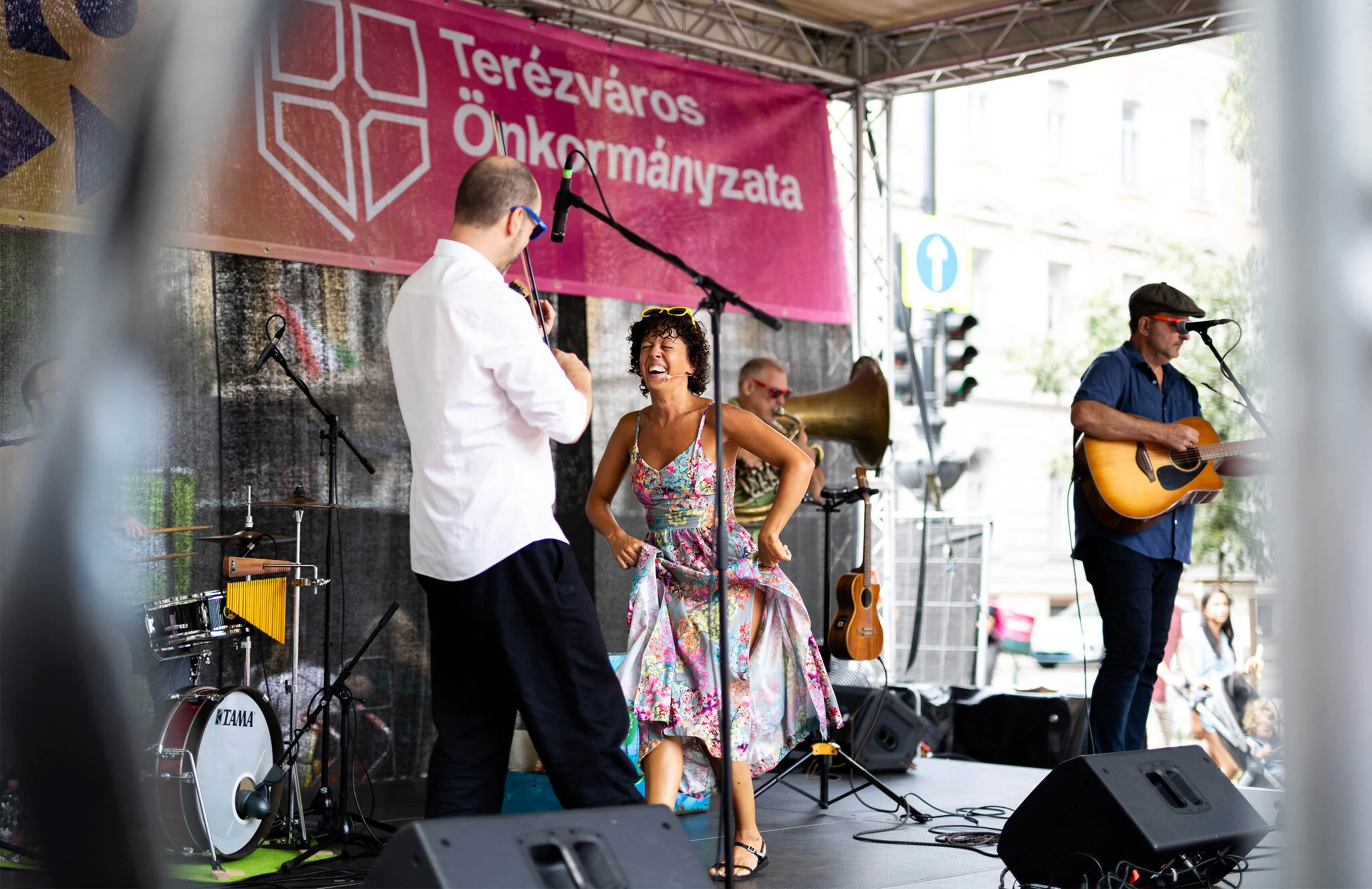
Photos: Terézváros Képszerkesztőség
Client: Terézváros Önkormányzata
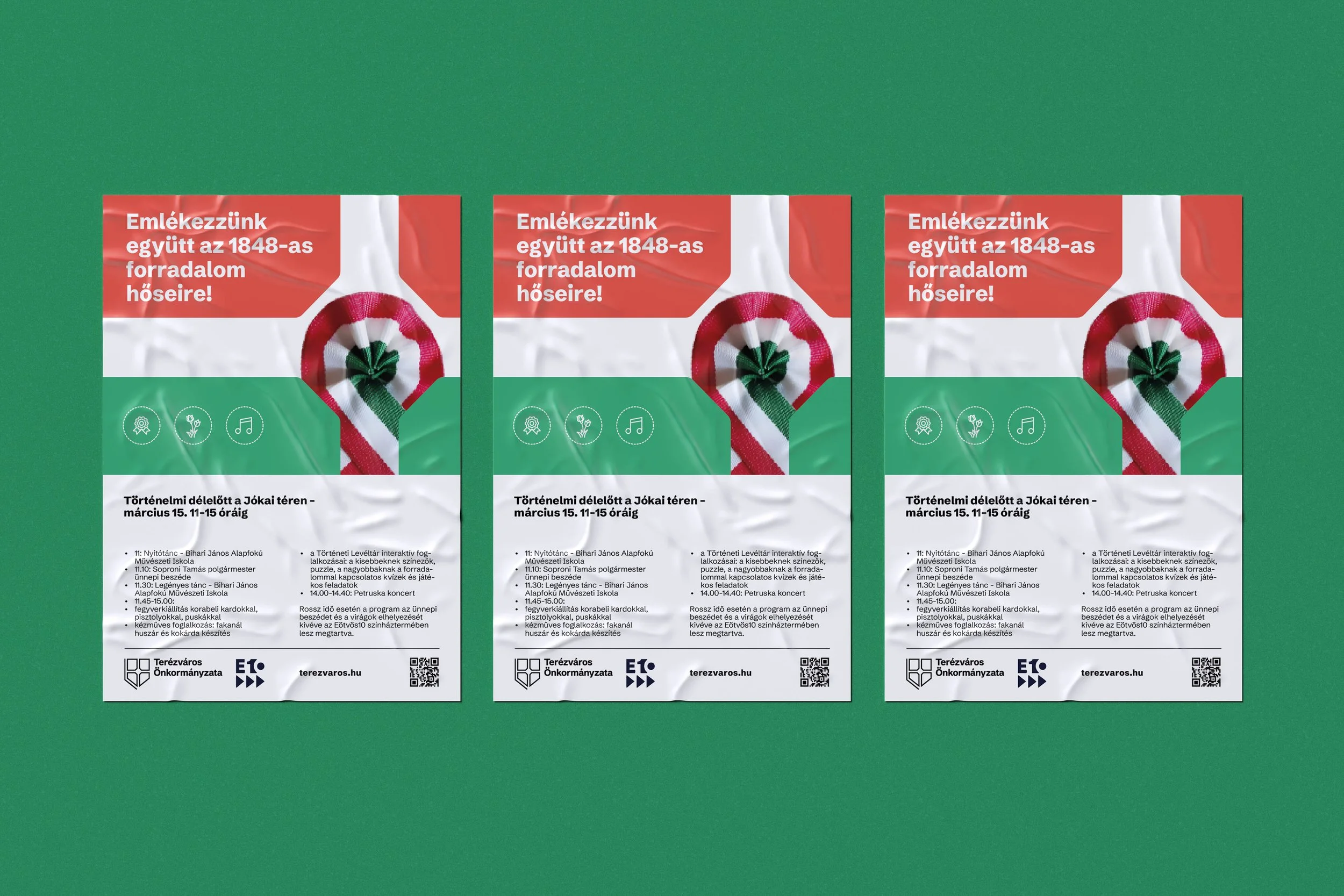
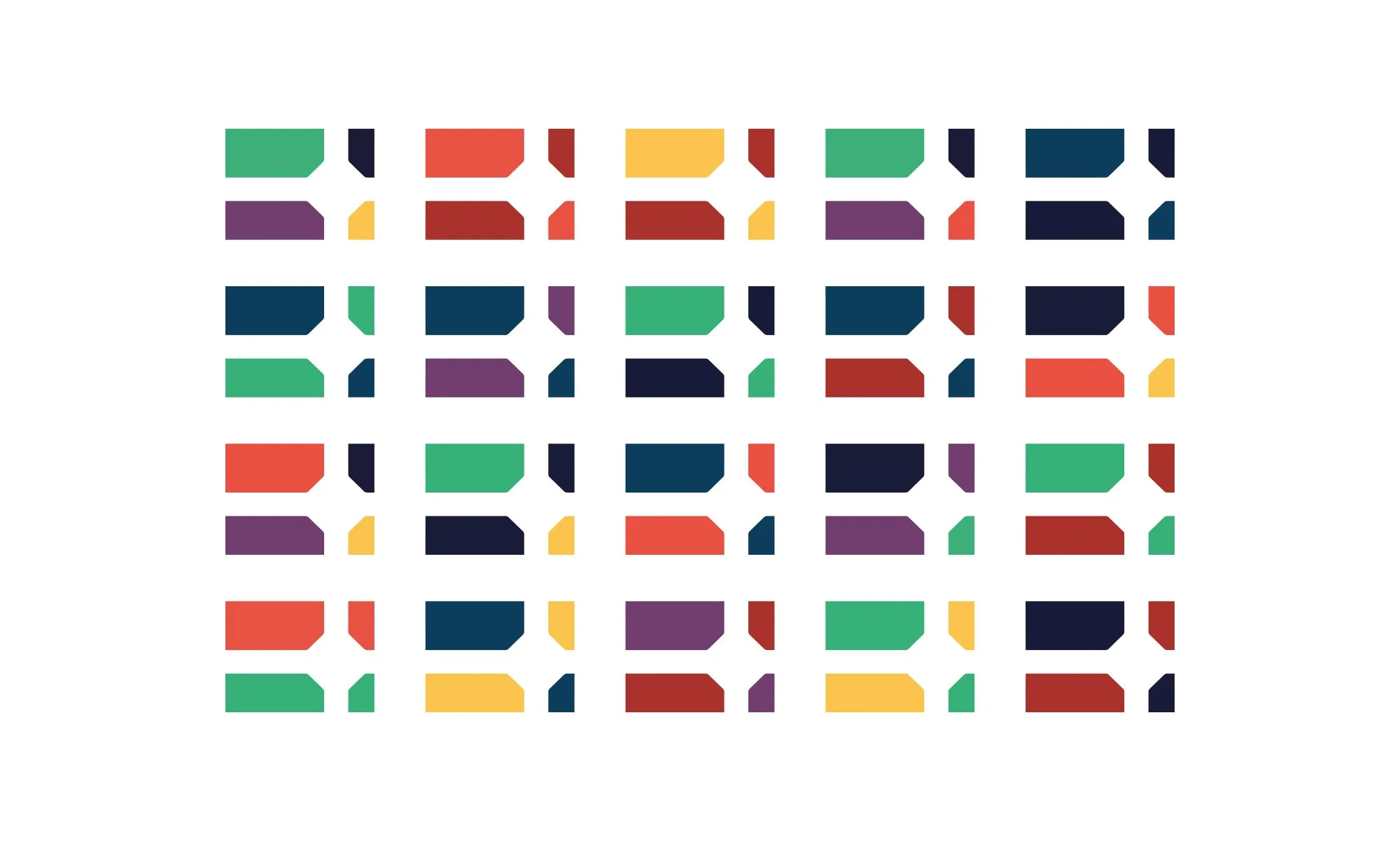
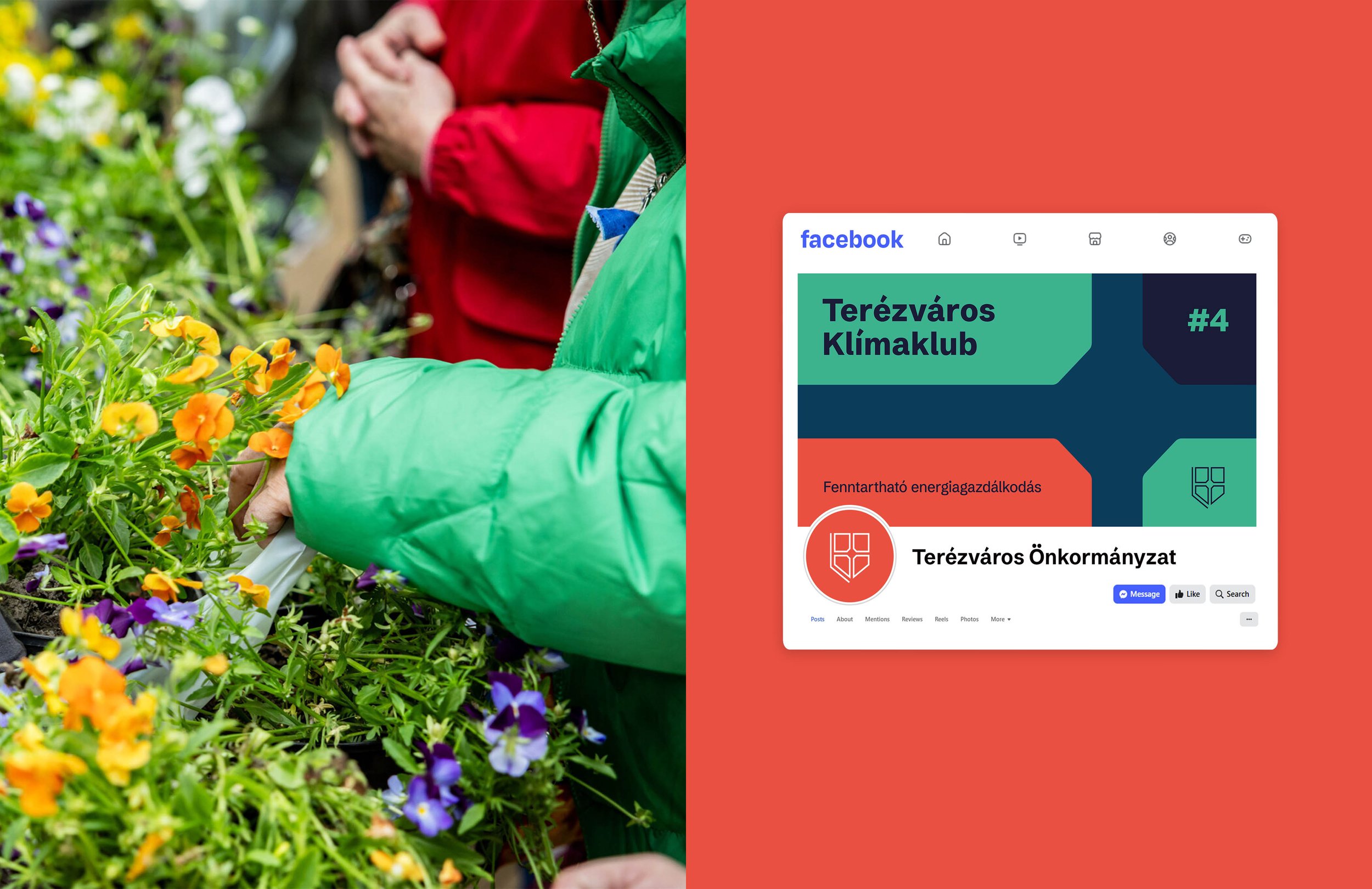
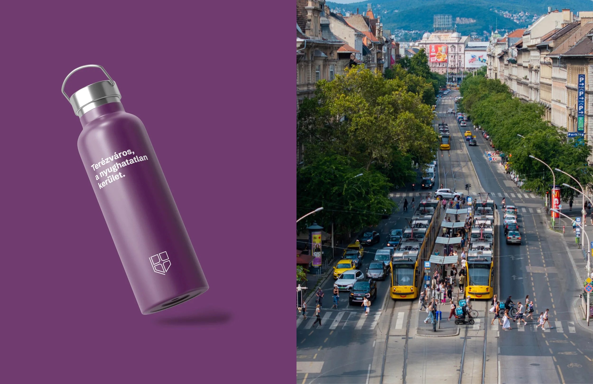
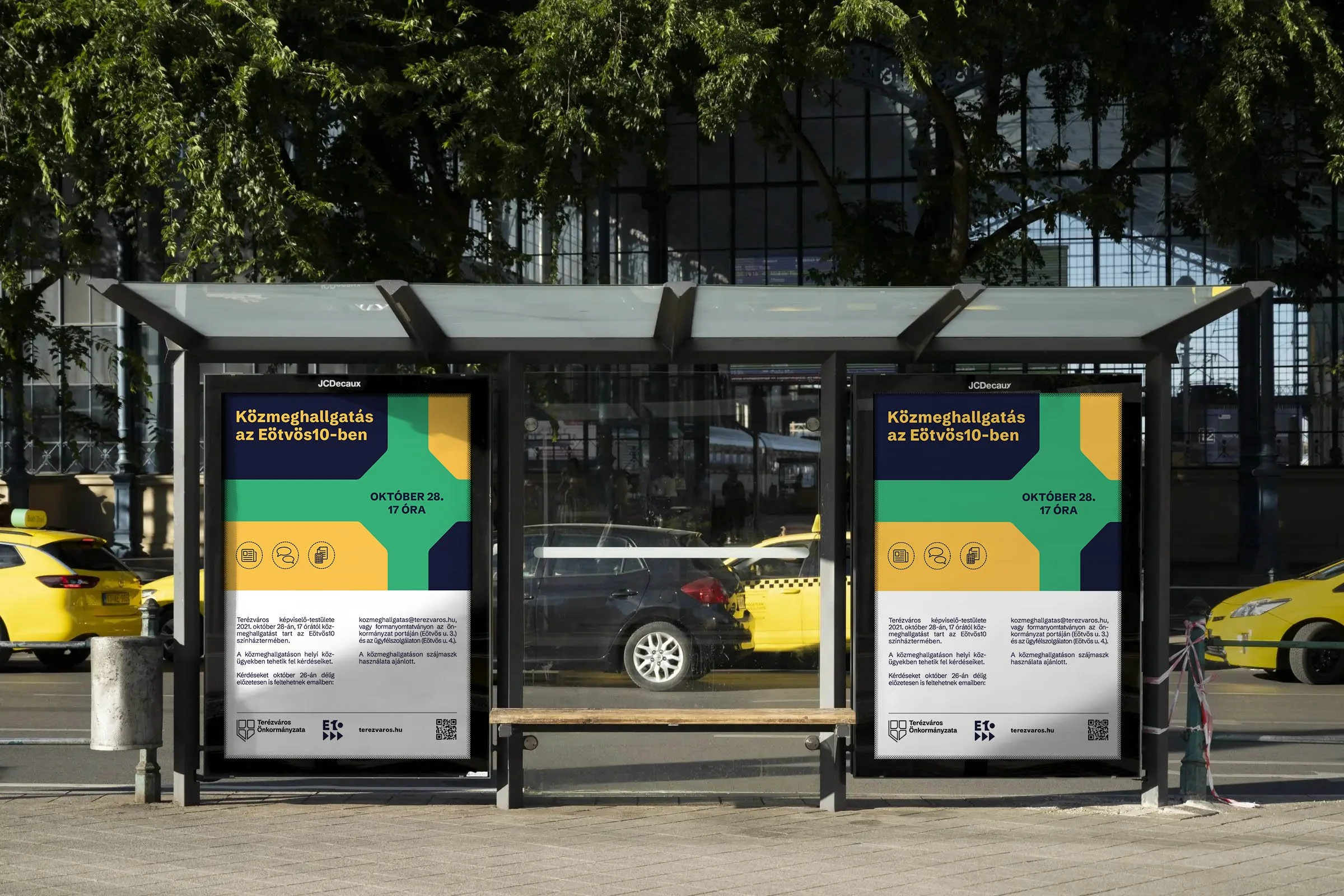
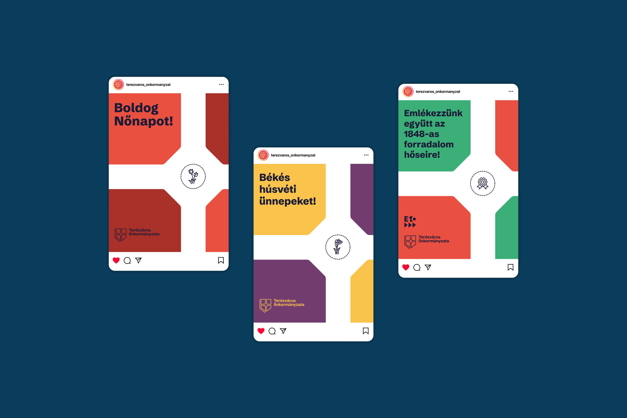
The inverse shape of the octagon became a key graphic element running throughout the entire identity system. This flexible motif allows for countless variations while maintaining a unified and recognizable character.
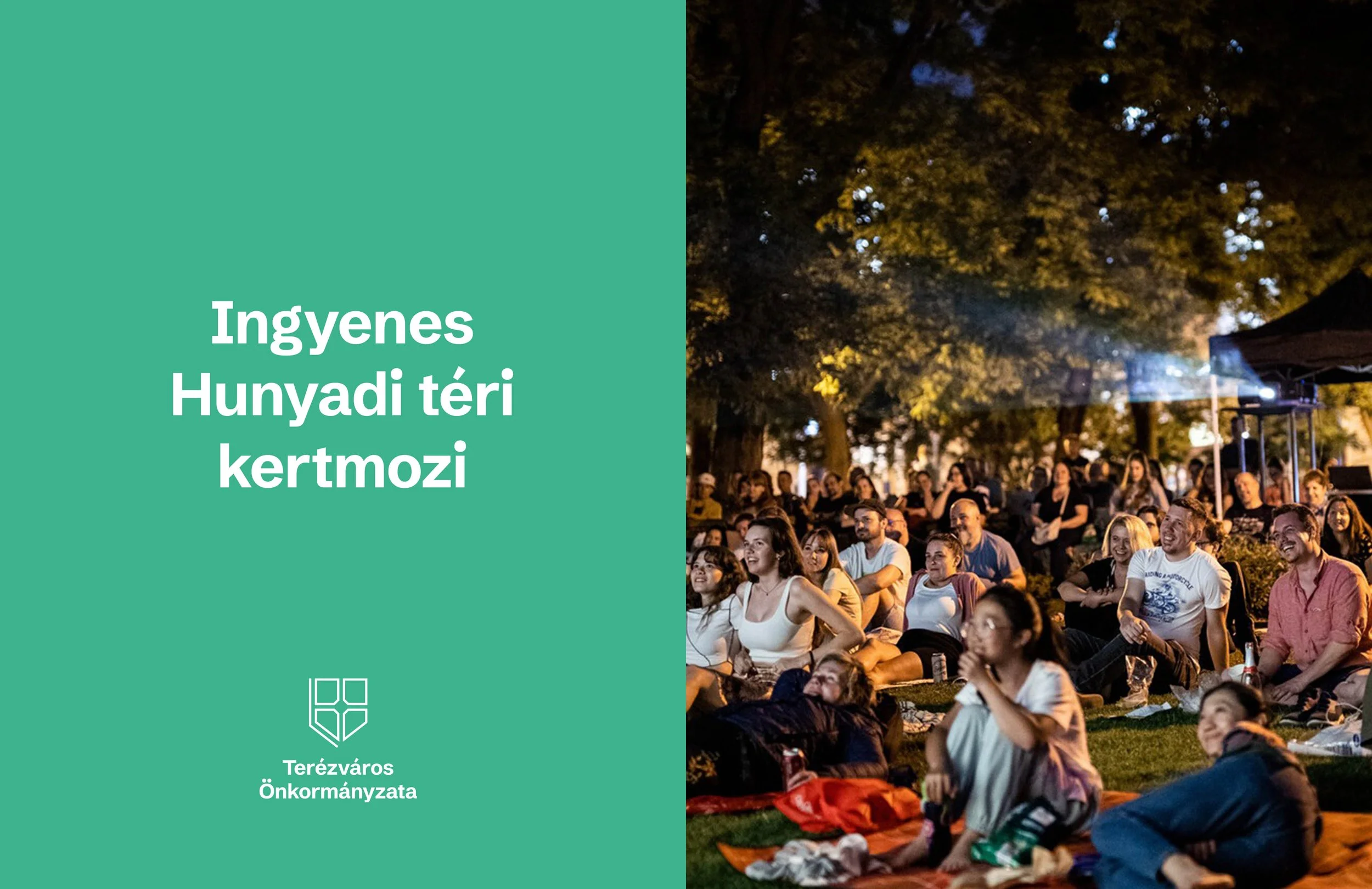
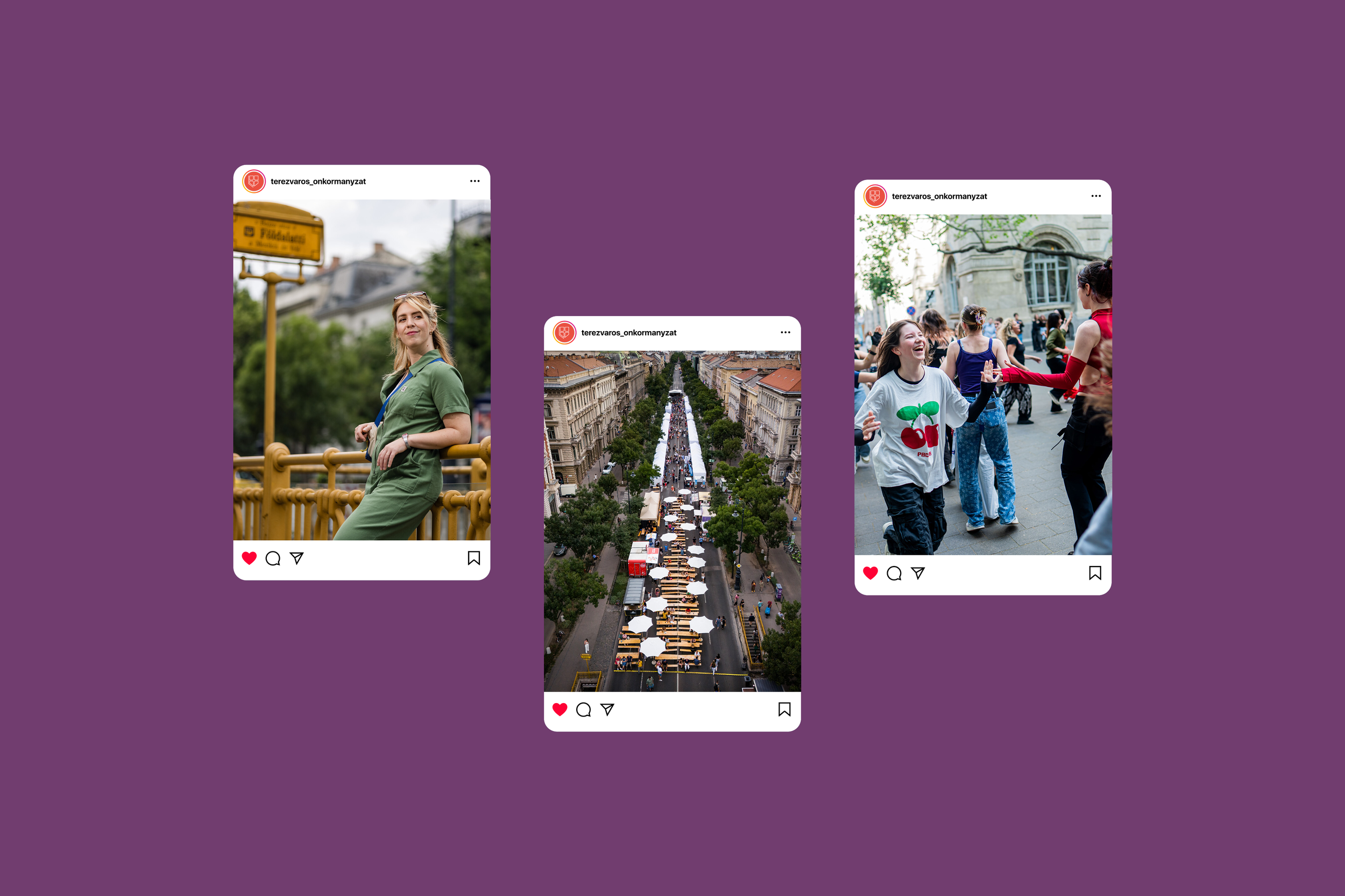
It works effortlessly when combined with photography, but also stands confidently on its own which is always an important consideration.
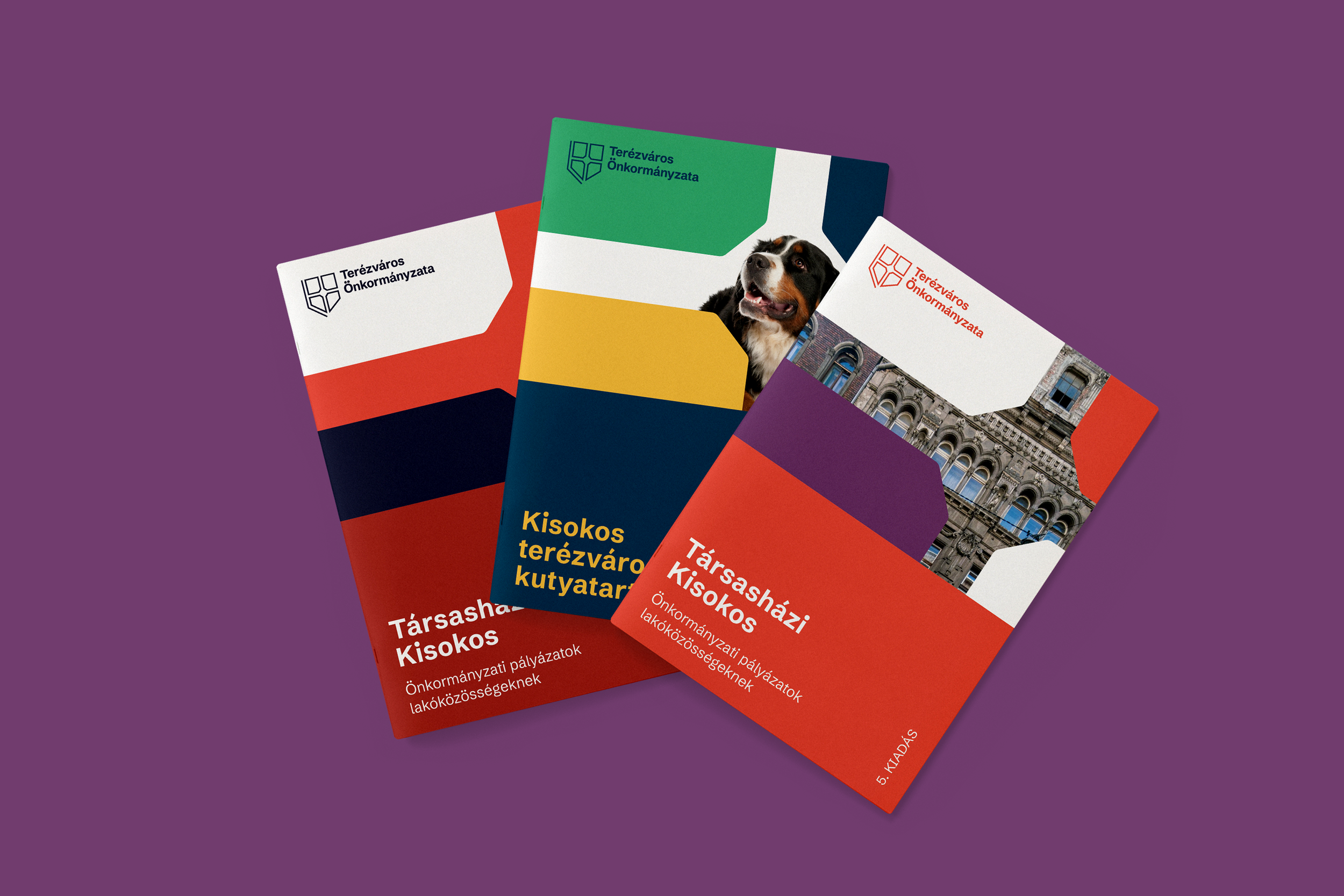
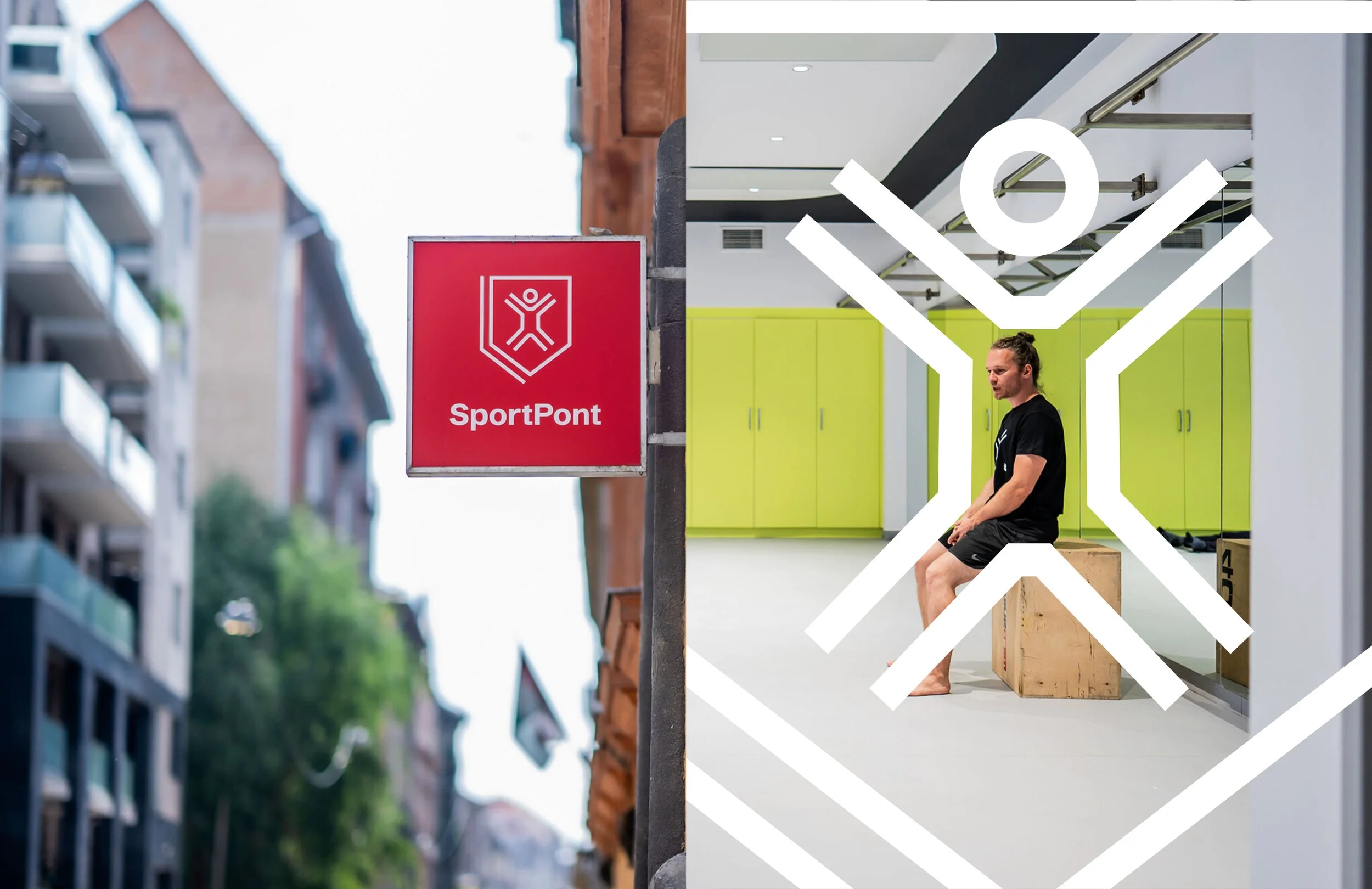
The icon set had already been a popular component of the previous design, so we expanded the collection with new, site-specific symbols such as the Opera House, the Nyugati Railway Station, and the sphinx in front of the Opera, highlighting the rich architectural heritage of the Terézváros district.
The original red and purple brand colors were preserved, while the palette was extended with five additional shades to allow for more versatile and expressive applications.
To support the everyday workflow of the district, we selected Schibsted, a freely available Google Fonts typeface, as the primary font of the identity.
The system was designed to be easy to modify, enabling the quick creation of new materials without lengthy design processes, while keeping the identity coherent and allowing Terézváros to stand out and authentically represent its local community.