Book about the life and work of Stefan Lengyel
Authors: Dorottya Füzesi, András Húnfalvi,
Zsuzsa Kálmán, Márton Szentpéteri
Art Direction: Luca Patkós
Photos: Máté Lakos
Client: Moholy-Nagy University of Art and Design
Printing: Pauker Nyomda
Photos from the book: Krisztián Lakosi
Book about the legacy that continues to inspire generations of designers
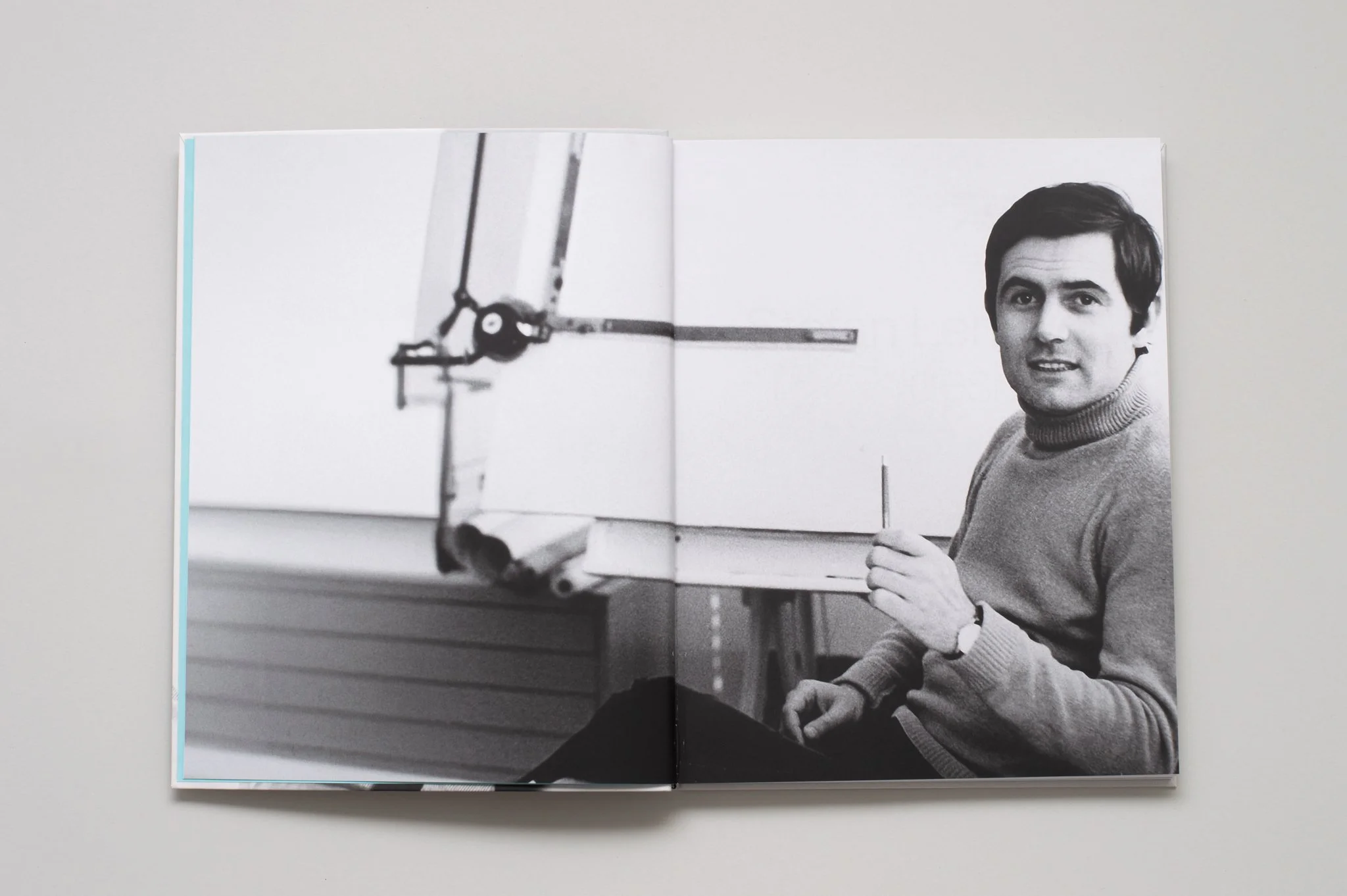
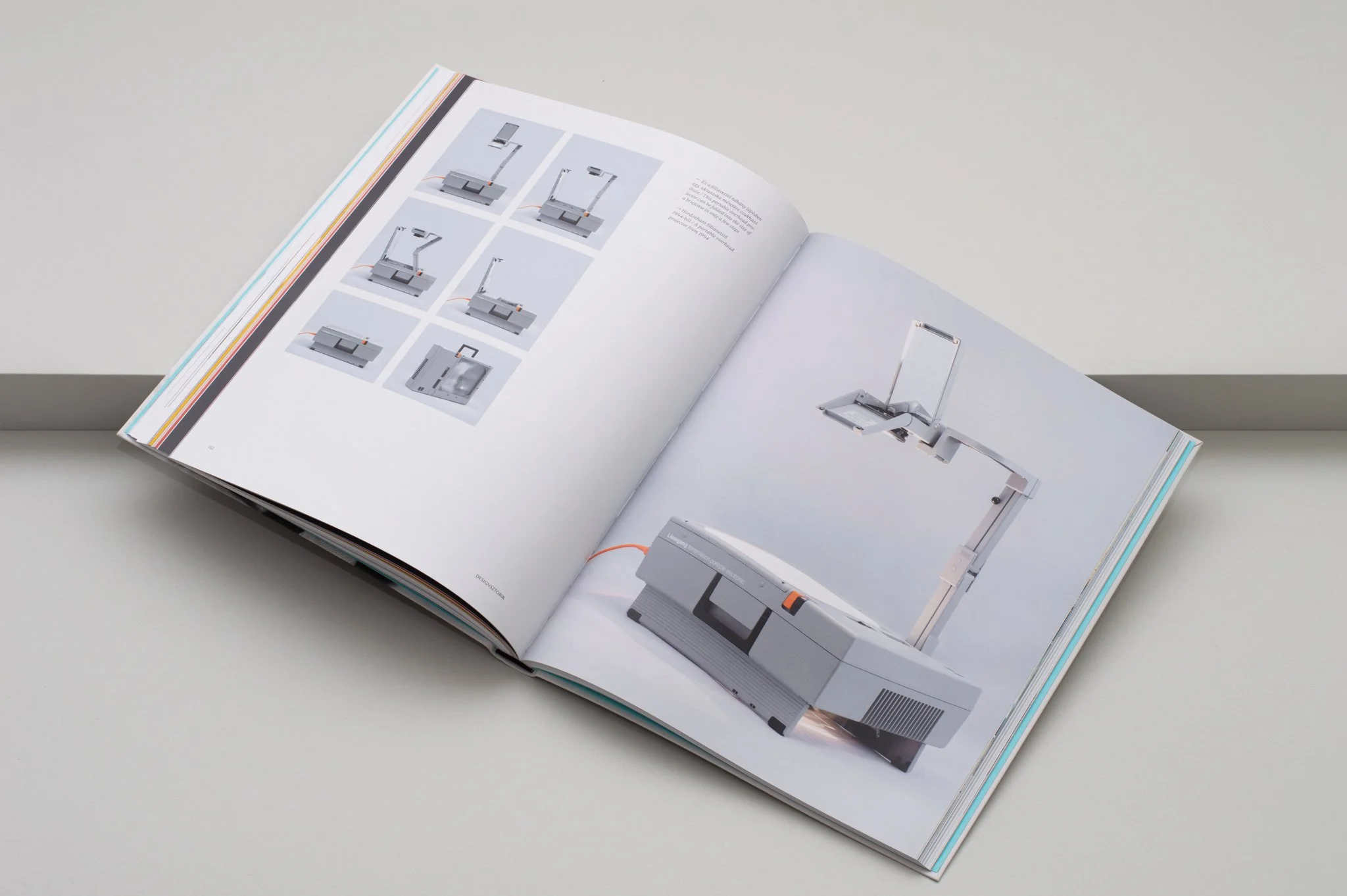
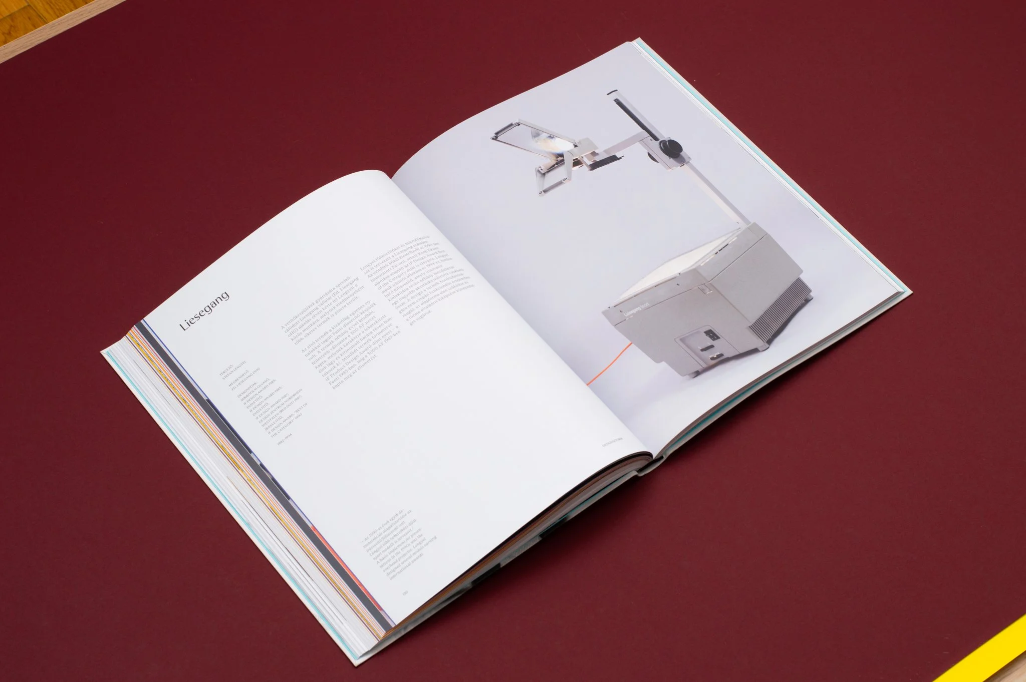
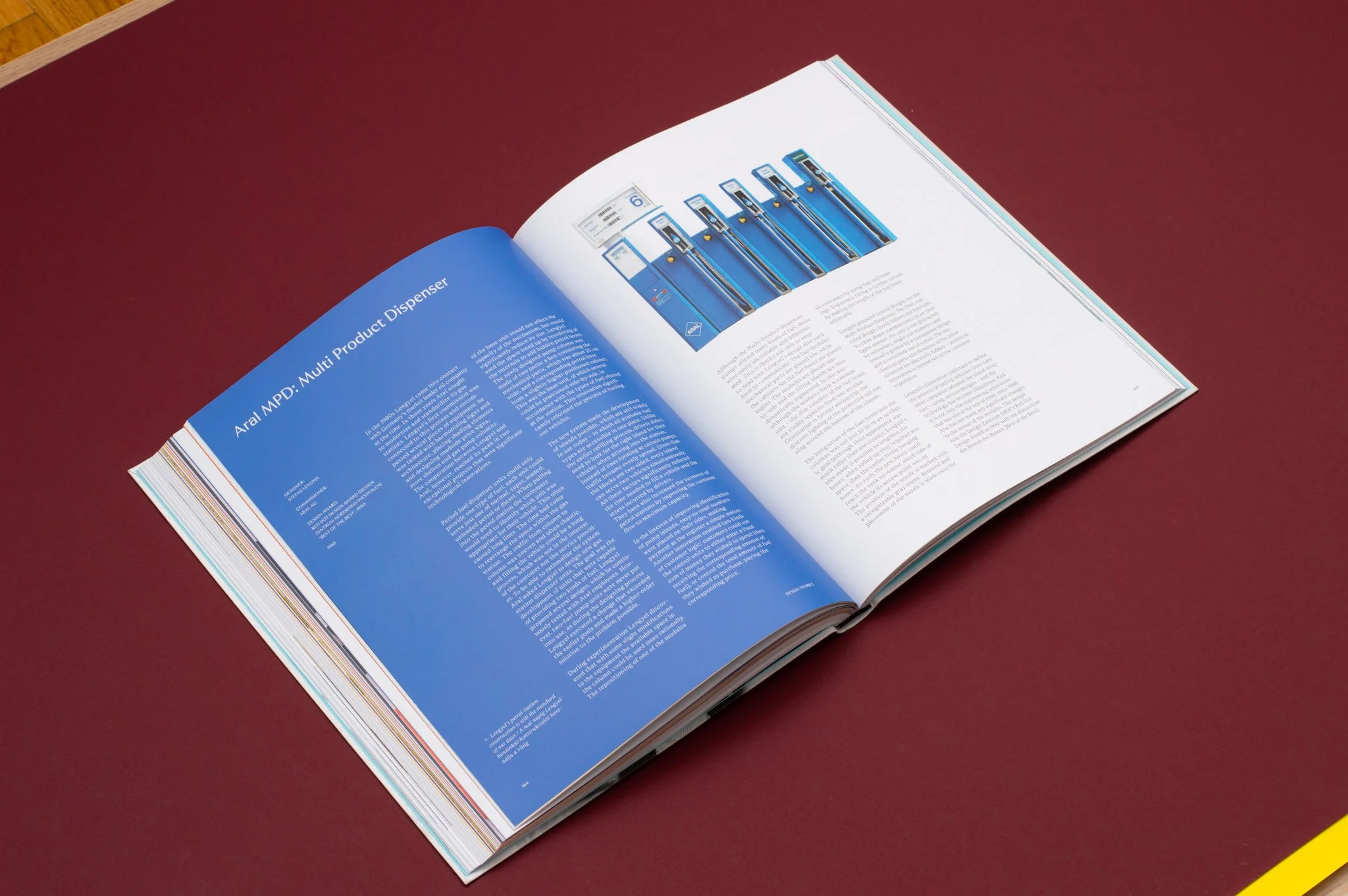
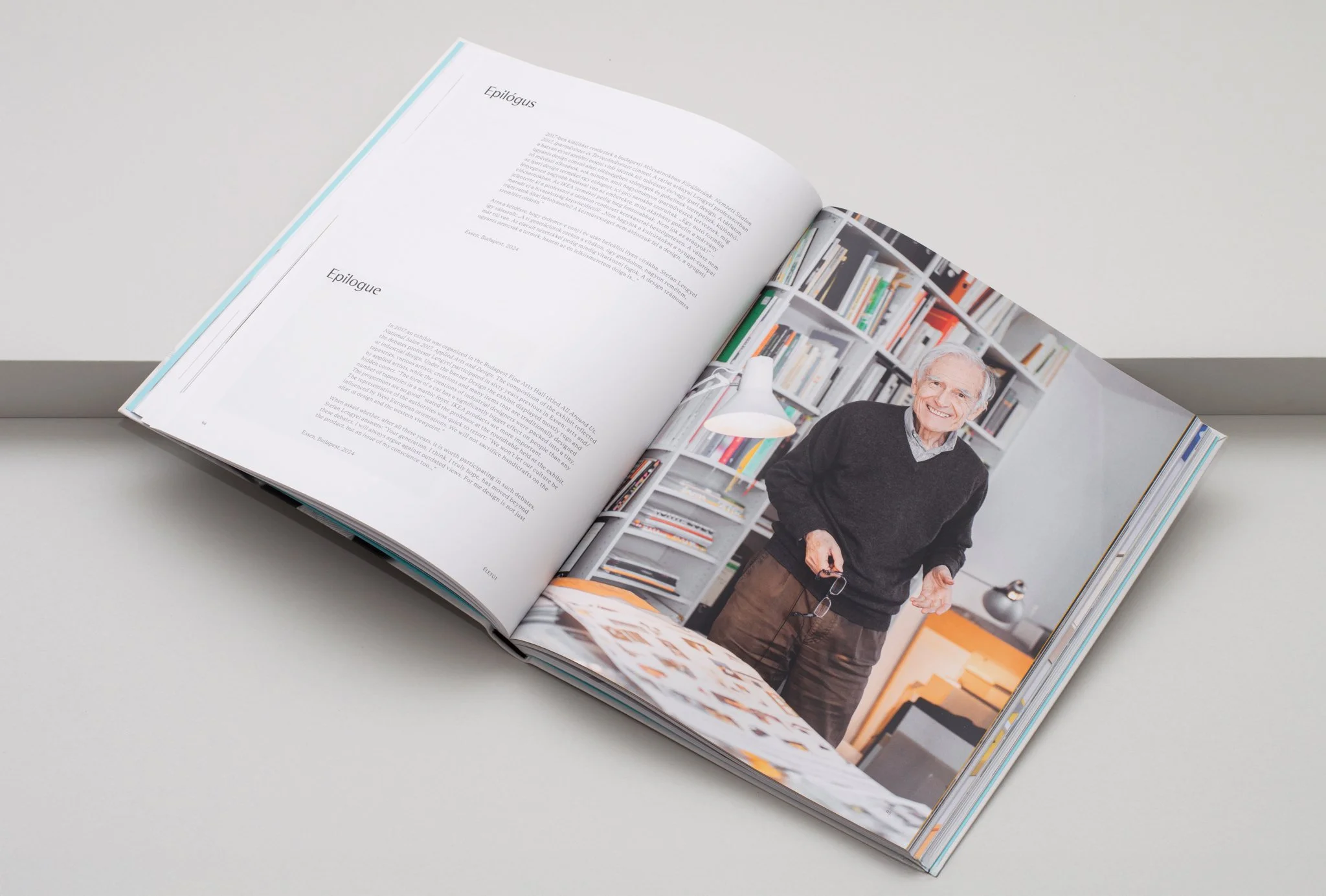
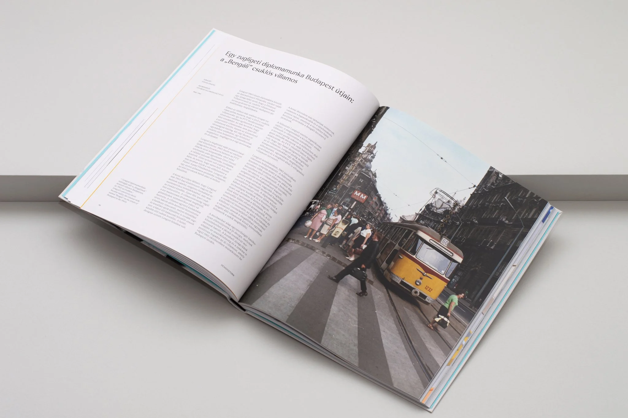
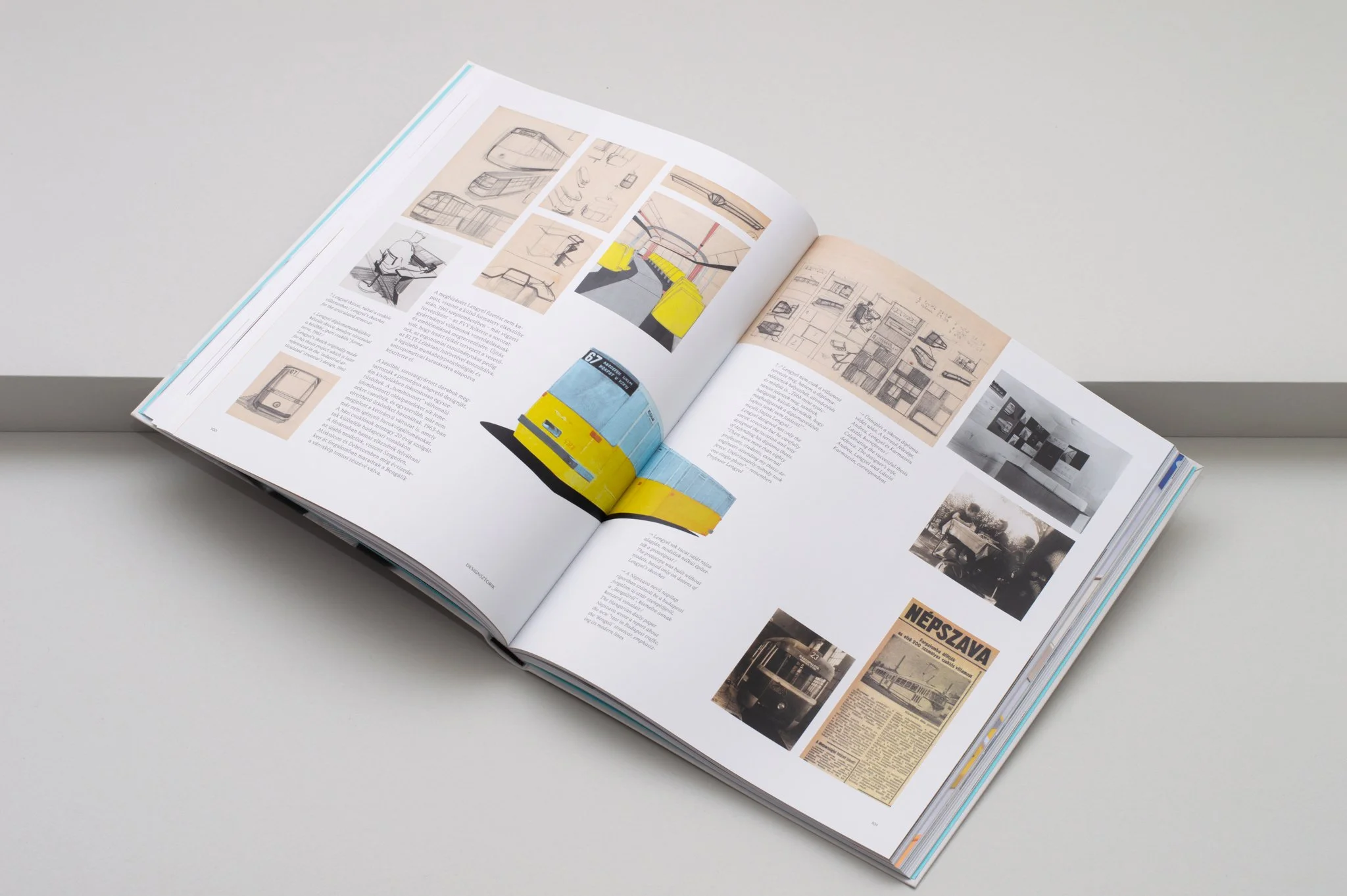
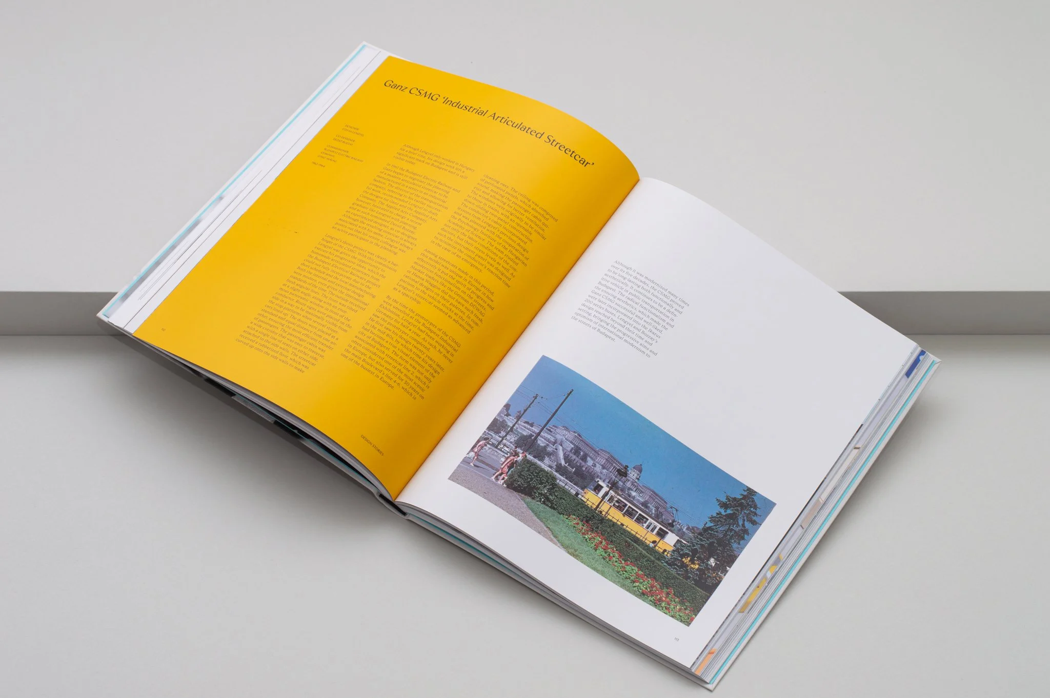
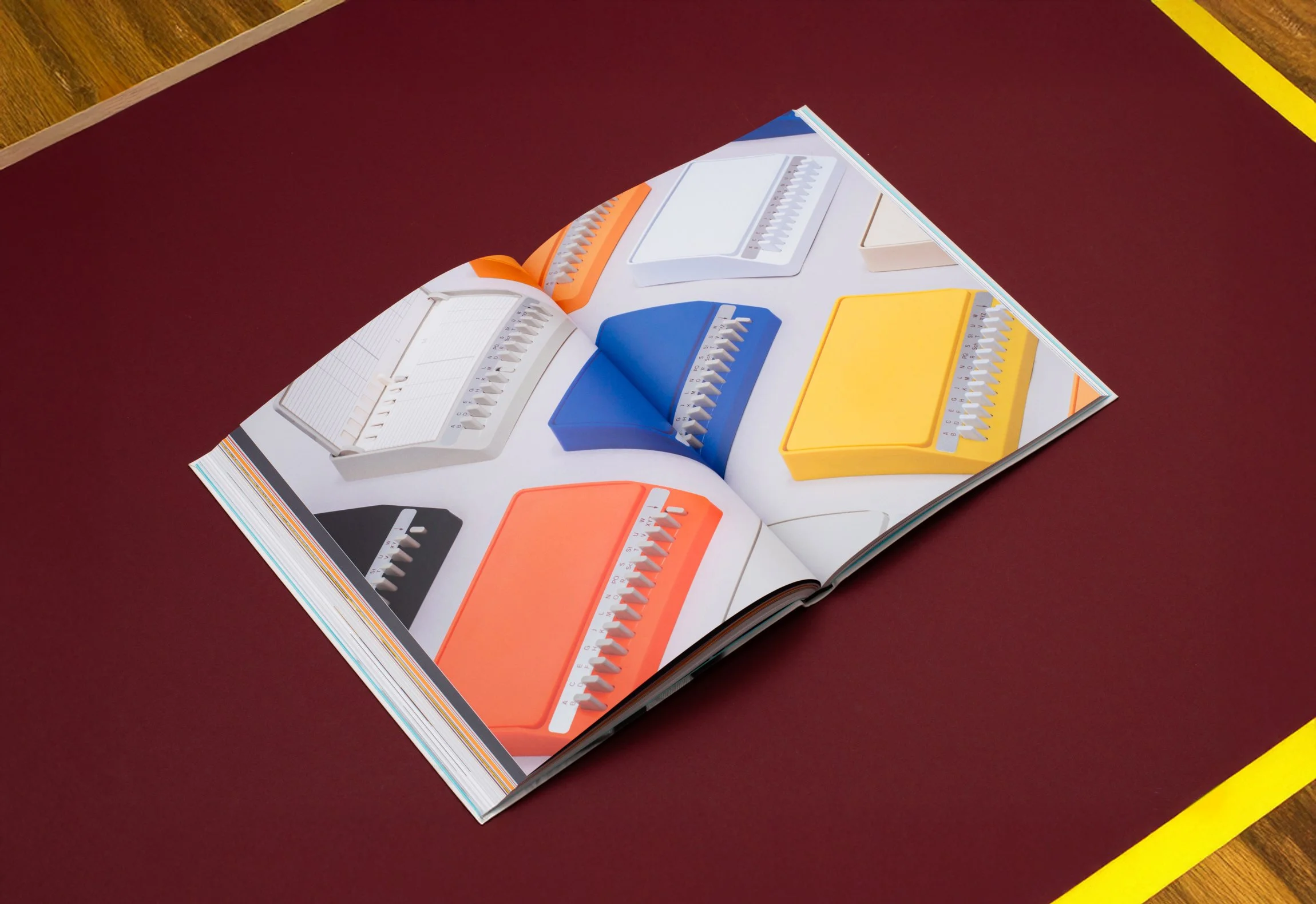
Stefan Lengyel is a defining designer in the history of Hungarian and German design in the 20th century. Even if you don't know his name, you've definitely seen objects he designed that have since become design icons, such as the Ganz industrial articulated tram, the multi-nozzle fuel pumps now found at every gas station, and the ergonomic vacuum cleaners that always turn toward you.
During his long and rich career, he was a leading consultant designer for Miele and Rosenthal, but he also designed for Vorwerk and many other global brands.
It is an honor that, as his former students and researchers of his work, András Húnfalvi was able to be a member of the team of authors consisting of Dorottya Füzesi, Zsuzsa Kálmán, and Márton Szentpéteri, who, together with Stefan Lengyel, collected and compiled his life's work in the form of a book of substantial and visual merit, published by the Moholy-Nagy University of Art and Design, with photographs by Máté Lakos.
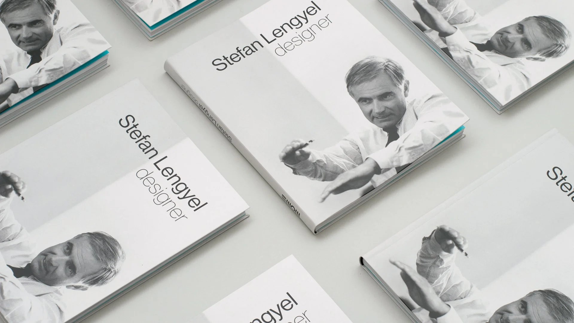
The book, published under the title Stefan Lengyel Designer, also has another Flying Objects connection: the book design and graphics were created by Luca Patkós.

A book design inspired by pure functionalism
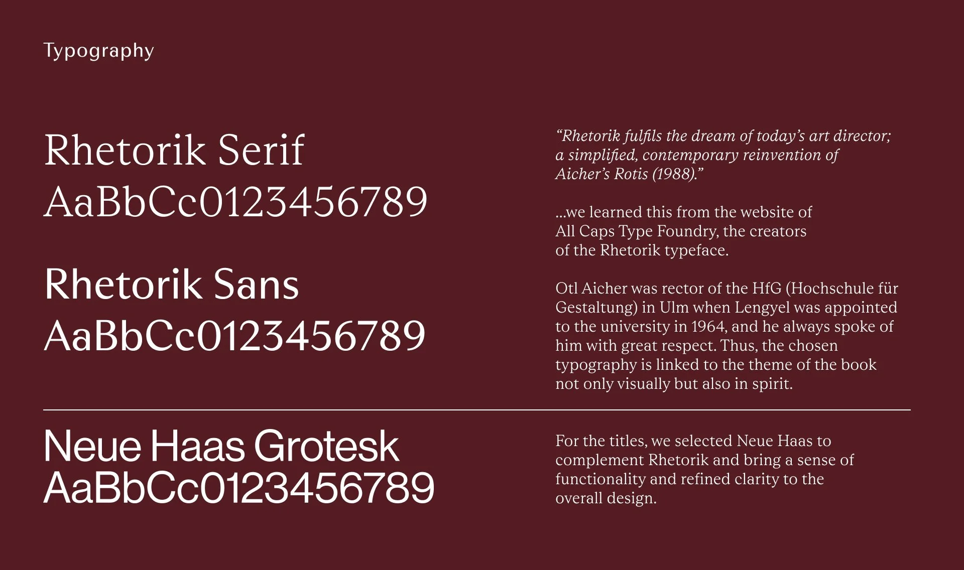
When we began designing the book, we took Stefan Lengyel's design ethos as our starting point, which is based on clean, yet human-centered functionalism. The goal was to let the images of his life and objects tell the story, while the typography and layout supported the processing and understanding with clean restraint.
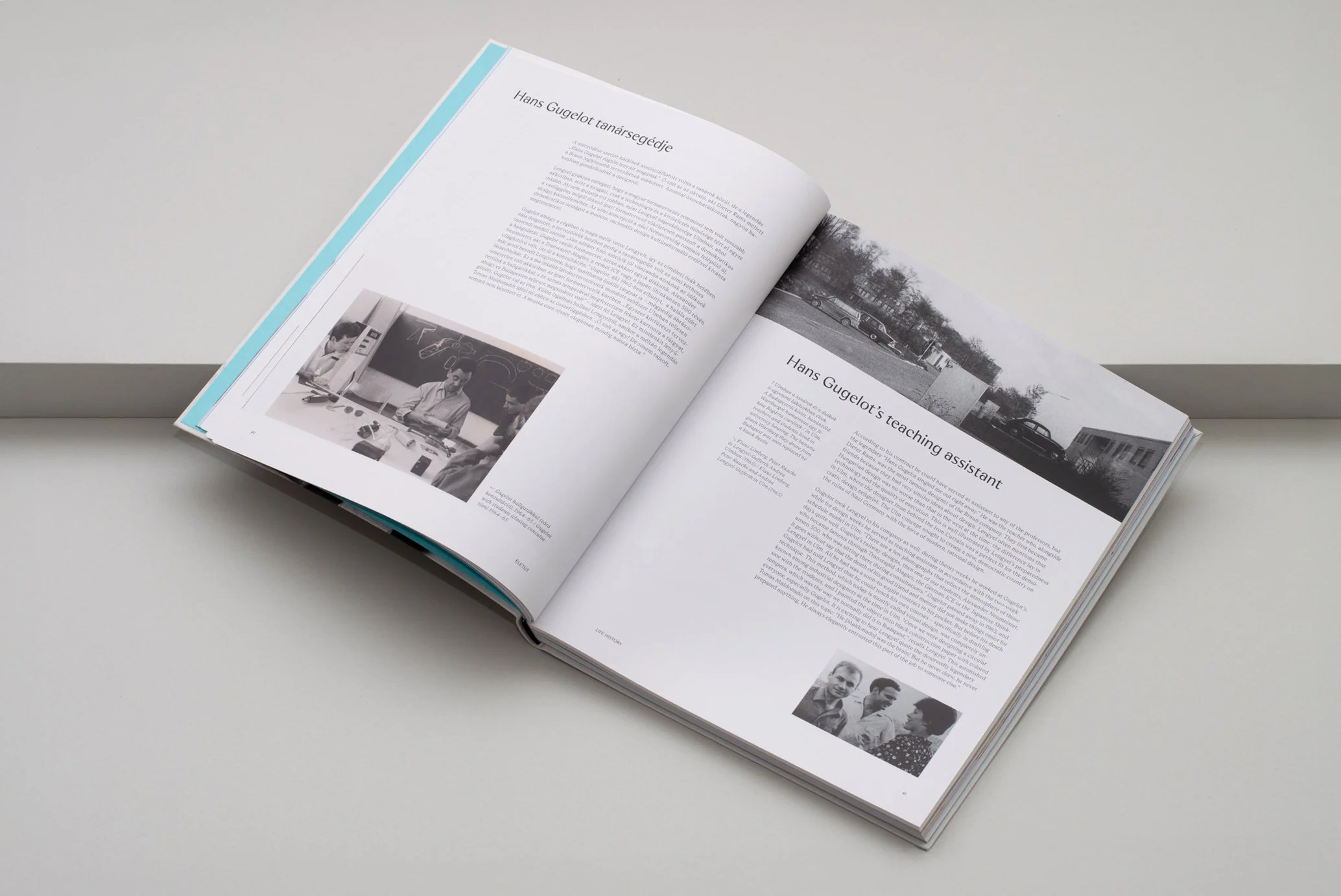
We used the neutral Neue Haas Grotesk font for the titles, while choosing the Rhetorik font family for the body text, project titles, and accompanying captions. All Caps Type Foundry reinterpreted Otl Aicher's Rotisa with this font. Aicher was rector of the HfG (Hochschule für Gestaltung) in Ulm when Lengyel was appointed to the college in 1964, and he always spoke of him with great respect.
Thus, the chosen typography is connected to the theme of the book not only visually, but also in spirit. For longer texts, the Serif version was used, while for shorter titles and comments, the Sans version ensured optimal typographic rhythm.
The publication is bilingual (Hungarian and English), so it was particularly important to clearly separate the languages. To achieve this, we used some of the characteristic, vivid shades of Lengyel's designs and products as color blocks and highlights. These visual cues aid comprehension while bringing dynamism to the mainly textual and often black-and-white visual material. The result is a transparent, functional, yet distinctive book that presents Stefan Lengyel's oeuvre in a fitting manner.