ŐSI MAGNESIUM
Designer: Luca Patkós
Client: Ősi Magnesium
Logo update, brand and packaging design
The brand name means Ancient Magnesium and it hides a true success story about a small company that dares to dream big. In just a few years, from a tiny workshop with a handful of employees, the Hungarian company grew into a mature enterprise with its own manufacturing plant.
They wished to represent the growth, the significant change and expansion of the product range with a new brand visual identity. Our task was therefore to update the logo, create a coherent visual identity manual and design the packaging.

Logo
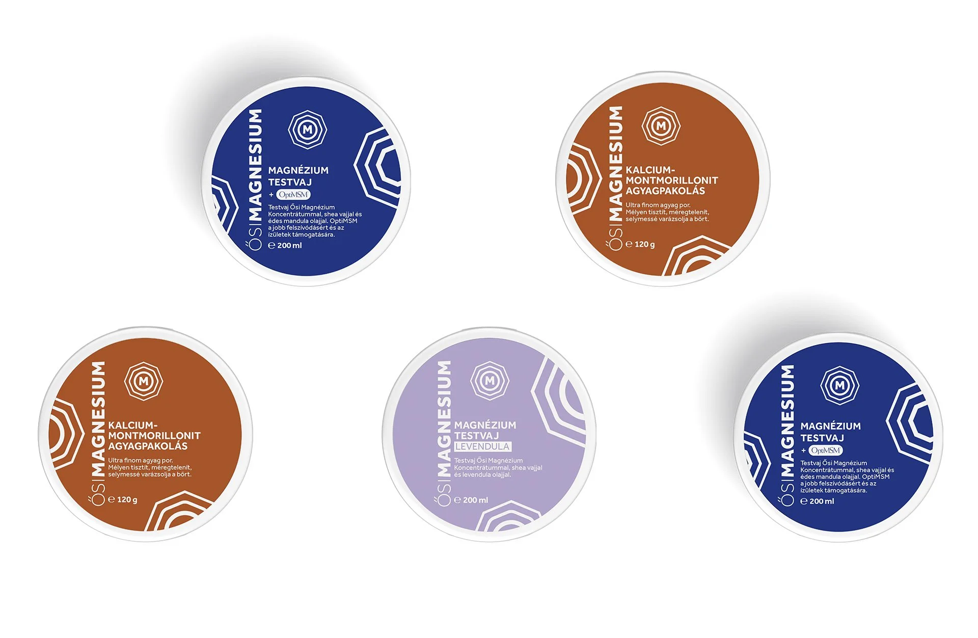
Ősi Magnesium manufactures and distribute skin absorbable magnesium products in a variety of forms. They use the purest source of magnesium chloride, mined from the depths of the Zeichstein Sea that covered parts of western Europe in the ancient times. The crystalline appearance of the minerals inspired the basic symbol.
The octagonal element of the logo and the letter M for magnesium were already in the original visual identity which we kept and updated it.
The letter M is surrounded by concentrically rounding forms, eventually enclosed by a perfect circle. This graphically represented 'softening' process symbolizes the relaxing and tension-relieving effect of magnesium. The shapes also appear as decorations on the packaging and labels, visually unifying the diverse product range. The logo is complemented by a brand name inscription, which can be versatilely used on any surface.


Brand and packaging
The brand range includes creams, lotions, oils and salts, so the packaging and branding should work in various ways, while remaining visually consistent.
We have assigned complimentary colours for the added ingredients that represent them, such as the lilac of lavender and the red of chili. These help customers to find their way around the products. The logo's octagonal and rounded shapes also appear on the labels and packaging.
In the branding manual, we have also designed and proposed a visual presentation for different media to ensure a clear brand coherence.